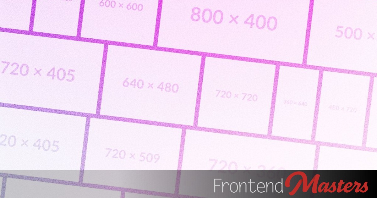
We’re diving into creating a unique layout featuring multiple rows of elements with varying sizes and known aspect ratios (like images), which takes the full width of a container.
We’ll achieve this with CSS flexbox, exploring the mathematics behind it.
## How Does Flexbox Distribute Space?
Understanding flexbox and its properties is essential to see how space is allocated.
“`css
.container {
display: flex;
}
“`
### Flex Properties
Key elements are set on the flex container.
“`css
.container {
display: flex;
flex-direction: row;
gap: 1rem;
flex-wrap: wrap;
}
“`
Properties are also applied to items in the container, which can be complex.
“`css
.container {
…
> .item {
flex-basis: 100px;
flex-grow: 1;
flex-shrink: 1;
}
}
“`
### Assumptions and Simplifications
The full flexbox algorithm is more intricate than this model. To focus on space distribution, we’ll simplify by ignoring certain flexbox aspects.
Ignored elements:
– Min/max-width or height of items.
– Redistribution when items hit size limits.
– Only a horizontal row is considered.
## Conceptual Model
Space in a row is distributed as follows.
### Initial Free Space
Calculate available or unavailable space: Flex container width minus flex-basis sum and gaps.
### Positive Initial Free Space (Growing)
If space is positive, items expand:
– If the sum of flex-grow values is less than 1, the space is scaled accordingly.
– The space is shared based on flex-grow.
### Negative Free Space (Shrinking)
If space is negative, items compress:
– If flex-shrink sum is less than 1, space is scaled, allowing overflow.
– Items with larger scaled-flex-shrink values shrink more.
### What About Wrapping?
– Without wrapping: Single row.
– With wrapping: Rows contain as many items as fit, with grow/shrink distribution applied per row.
## Mathematical Model
Using variables:
– ( w_i ): final width of item ( i )
– ( FB_i ): flex-basis of item ( i )
– ( FG_i ): flex-grow of item ( i )
– ( FSH_i ): flex-shrink of item ( i )
– ( IFS ): initial free space
– ( n ): number of items in a row
Calculate ( IFS ):
[ IFS = ContainerWidth – sum_{i=1}^{n} FB_i – GapWidth cdot (n – 1) ]
For positive ( IFS ):
[ w_i = FB_i + IFS cdot frac{FG_i}{sum_{k=1}^{n} FG_k} cdot minleft(1, sum_{k=1}^{n} FG_kright) ]
For negative ( IFS ):
[ w_i = FB_i + IFS cdot frac{FSH_i cdot FB_i}{sum_{k=1}^{n} FSH_k cdot FB_k} cdot minleft(1, sum_{k=1}^{n} FSH_kright) ]
### Again, Wrapping?
Without wrapping: ( n ) is the item count. With wrapping: Maximum ( n ) such that:
[ sum_{i=1}^{n} FB_i + GapWidth cdot (n – 1) leq ContainerWidth ]
## The Masonry Layout
Combining constraints:
1. ( AR_i = frac{w_i}{h_i} )
2. ( sum_{i=1}^{n} w_i = ContainerWidth )
3. ( h_i = H ) for all ( i )
Combine:
[ w_i = AR_i cdot H ]
[ sum_{i=1}^{n} AR_i cdot H = ContainerWidth ]
[ H cdot sum_{i=1}^{n} AR_i = ContainerWidth ]
## Results
For positive/negative ( IFS ):
[ h_i = H = CB + frac{IFS}{sum_{k=1}^{n} AR_k} ]
[ w_i = FB_i + IFS cdot frac{AR_i}{sum_{k=1}^{n} AR_k} ]
### The Intuition
All items start at the same height due to `flex-basis`. Widths adjust according to `flex-grow` and `flex-shrink`, ensuring all items share the same height.
## Demos
Examples include layouts with and without wrapping, limits, and images.