### The Updated Apple Music Album and Playlist Interface: A Two-Edged Sword for Users
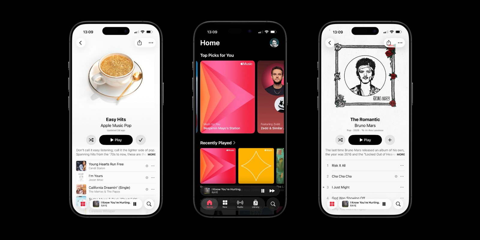
With the launch of iOS 26.4, Apple Music has unveiled a redesigned album and playlist interface that has elicited mixed feedback from users. While many are fond of the visually striking design that adjusts colors to align with album art, fervent dark mode enthusiasts are voicing disappointment over the interface’s brightness, especially at night.
#### The Brightness Problem in Dark Mode
The new design’s dynamic color scheme can lead to bright displays when users select albums featuring mainly light-colored art. This has resulted in what some users are referring to as “flash bangs,” a disconcerting experience for those who prefer dark mode to alleviate eye strain and save battery life during nighttime usage. The Apple Music subreddit has experienced an uptick in conversations and grievances about this matter since the update.
#### Sensitivity of Users and Community Reactions
The responses to the updated design reveal a split among users. Some are more affected by the brightness shifts, whereas others may not perceive it as problematic. Nonetheless, the amount of feedback indicates that a considerable segment of the Apple Music community is looking for a remedy to the issue.
#### Possible Solutions and Alternatives
Resolving the brightness dilemma will probably necessitate an update from Apple. Users have proposed that the company might incorporate a feature allowing the interface to draw from a selection of muted colors when in dark mode. Alternatively, providing an option to personalize the application’s behavior for dark mode users could prove advantageous.
For now, there is a workaround available for those impacted by the brightness. By activating the “Increase Contrast” accessibility feature, users can lessen the aggressive adaptive theming of Apple Music. This configuration ensures that the backdrop for album song lists stays black in dark mode, offering a more uniform experience.
#### Steps to Activate Increase Contrast
To activate the Increase Contrast mode across the system, users can go to:
– **Settings** -> **Accessibility** -> **Display & Text Size** -> toggle on **Increase Contrast**.
For a more customized option, users can enable Increase Contrast specifically for the Apple Music application:
1. Access **Settings** -> **Accessibility** -> **Per-App Settings**.
2. Choose **Add App** and select **Apple Music**.
3. Turn on the **Increase Contrast** toggle for the app.
If users later decide to undo this setting, they can go back to the Accessibility settings and adjust the Per-App Settings list.
#### Summary
The updated Apple Music design has ignited an engaging debate among users, particularly those who depend on dark mode. While the bright interface can be startling, solutions like the Increase Contrast option offer temporary respite. Ultimately, an update from Apple may be crucial to thoroughly address the concerns of dark mode users and improve their overall experience with the application.