Target Circle⢠Deal Days (also known as Circle Week) ends on Friday, March 27, 2026. Shop thousands of markdowns before the sale ends.

Target Circle⢠Deal Days (also known as Circle Week) ends on Friday, March 27, 2026. Shop thousands of markdowns before the sale ends.
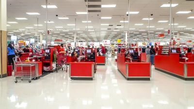
Walmart has launched its spring sale to compete against Amazon’s Big Spring Sale. The savings aren’t as good as Amazon’s, but we’ve plucked the best deals of out the weeds.
Amazon’s Big Spring Sale has some great home deals. Save 60% on Shark robot vacuums and 21% on cooling bed sheets.
Newly released 2026 robot vacuums are on sale for Amazon’s Big Spring Sale, like the Eufy C28 and Roborock Qrevo Curv 2 Flow.
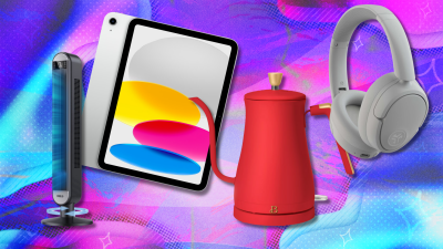
I’m a tech editor, and I found the top tech deals from Amazon’s Big Spring Sale. Grab Sony headphones for $48, Kindles for $94, and $250 off MacBooks.

Amazon’s Big Spring Sale is back until March 31. Take $100 off Apple Watch Series 11, 60% off Shark robot vacuums, and Kindles for $95.

The 65-inch Samsung Class QLED Q8F 4K TV is on sale during the Amazon Big Spring Sale for $597.99, down from the list price of $897.99. That’s a 33% discount.

We found the best AirPods deals to shop during Amazon’s Big Spring Sale. Grab AirPods 4 for $99, and save $60 on AirPods Pro 3.

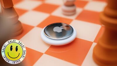
Amazon’s Big Spring Sale is live, and Apple AirTags are now at a record-low price.
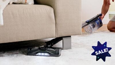
The Shark Pet Cordless Vacuum is on sale at Amazon for $149, down from the list price of $299.99. That’s a 50% discount.