In earlier articles, we examined a common case of anchor positioning: Tooltips. Here, we will investigate a less familiar application showcasing the power of new CSS features and modern CSS in general.
At the time of writing, only Chrome and Edge fully support the required features.
Let’s begin with a demo. Move both circles and observe how the arrow tracks their movement. You will also see the distance between the two circles within the arrow shape. If the circles are too close, the arrow shape changes!
Apart from the drag feature, everything else is managed via CSS. The position and shape of the arrow, distance calculation, collision/proximity detection, etc. It may be hard to believe, but CSS has advanced significantly to make this possible!
“Why CSS?!”
This classic question arises often. You might think this task isn’t fit for a CSS-only approach, and I agree. Many tools/libraries use JavaScript and/or SVG, which handle the task well. So use them if you require this kind of feature.
My CSS-only demo can be viewed as an experiment with new CSS features. The aim isn’t the demo itself, but the steps and tricks used in its creation. Pushing CSS limits to create things that seem “impossible” is the best way to learn CSS. “Impossible” because some things I couldn’t initially build, but when I do, I write articles about them.
If you’re keen to learn cool CSS tricks and discover modern features, you’re in the right place!
The Initial Configuration
One element can be anchored to several elements (in this case, two).
The code creates a rectangle around both circles. It’s the smallest rectangle capable of holding both circles. Move the circles in the demo below to see this in action.
Each rectangle side considers both circles’ minimum values. For a better understanding, consider each side individually. For example, the top value aligns with the highest circle’s top value, and that circle will logically have the smallest top value.
It can be optimized using:
The ‘inside’ value refers to the same side where it’s used. With top, it equals top; with left, it equals left, etc.
This yields the same value for all properties, which we can turn into a variable:
Or simply use the ‘inset’ property:
Let’s update the inset property to make the rectangle start at the circles’ centers:
Adding half the distance to each side reduces the rectangle size, resulting in the following:
Do you see the direction we’re headed? With barely two or three CSS properties, a connection between the circles is visible.
Linking the Circles
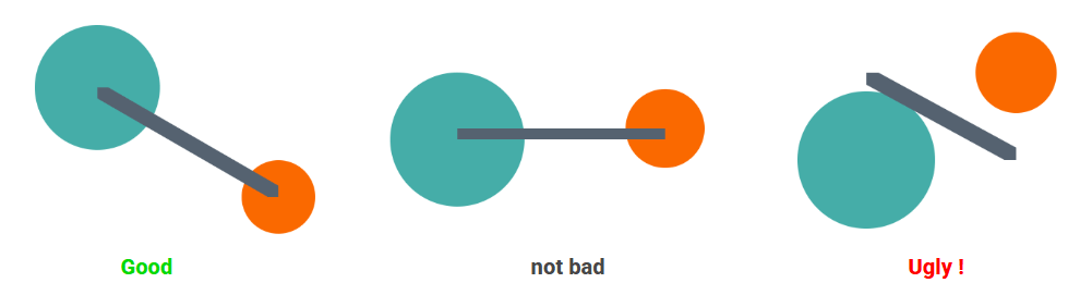
With a rectangle following both circles’ positions, my first thought was to reshape that rectangle into an arrow.
Using ‘clip-path’, let’s start with a simple shape:
Initially, it looks decent, but when you start moving the circles, it appears chaotic.
The shape links the rectangle’s top-left corner to the bottom-right corner. This isn’t ideal as we can have four different positions, and this works for two of them (A and D).
Adjusting the shape for positions B and C is needed. The question: How do we identify our position?
In theory:
When in position A, the first circle has a smaller left and top value, so ‘–x’ equals ‘-1’ and ‘–y’ also equals ‘-1’. In position B, we get ‘1’ and ‘-1’, and so on.
Based on ‘–x’ and ‘–y’ values, we can conditionally have different shapes per position, but since the ‘anchor()’ function can only be used with inset properties, this isn’t feasible. Hopefully, future developments will change this, but for now, we need another solution.
The solution I found involves having one element per position, so the HTML for the arrow looks like:
Then, define each position:
No need for ‘min()’, instead use ‘–_x’ and ‘–_y’ values. The code may seem complex at first, but referring to the previous figure clarifies its logic.
Positions A and B share the same vertical position for both circles, having the same top and bottom value. A and C have the same horizontal position, hence the same left and right value, etc.
But will all four elements be visible at once?
Not really. For instance, the ‘‘ element’s inset values are:
In position A, it is visible, but in position B, it isn’t because ‘left_of_c1’ exceeds ‘right_of_c2’. When the right value surpasses the left, they become equal, rendering the element width zero, hence invisible.
The demo is worth a thousand words. Moving the circles reveal four colors per element, but only one is visible at a time.
Observing that each position is a flipped version of another simplifies the code. Do the job once, then flip!
Let’s try the previous ‘clip-path’ again:
Now, a shape effectively links the two circles. Let’s work