Introduction
In Salesforce, the user interface can be customized via the Salesforce declarative approach and Aura/LWC (Lightning Web Components) components. Additionally, SLDS is utilized for creating a rich UI.
Why SLDS?
SLDS provides ready-to-use HTML and CSS (Cascading Style Sheets) UI elements for a seamless Salesforce experience in custom UI development.
Design Principles
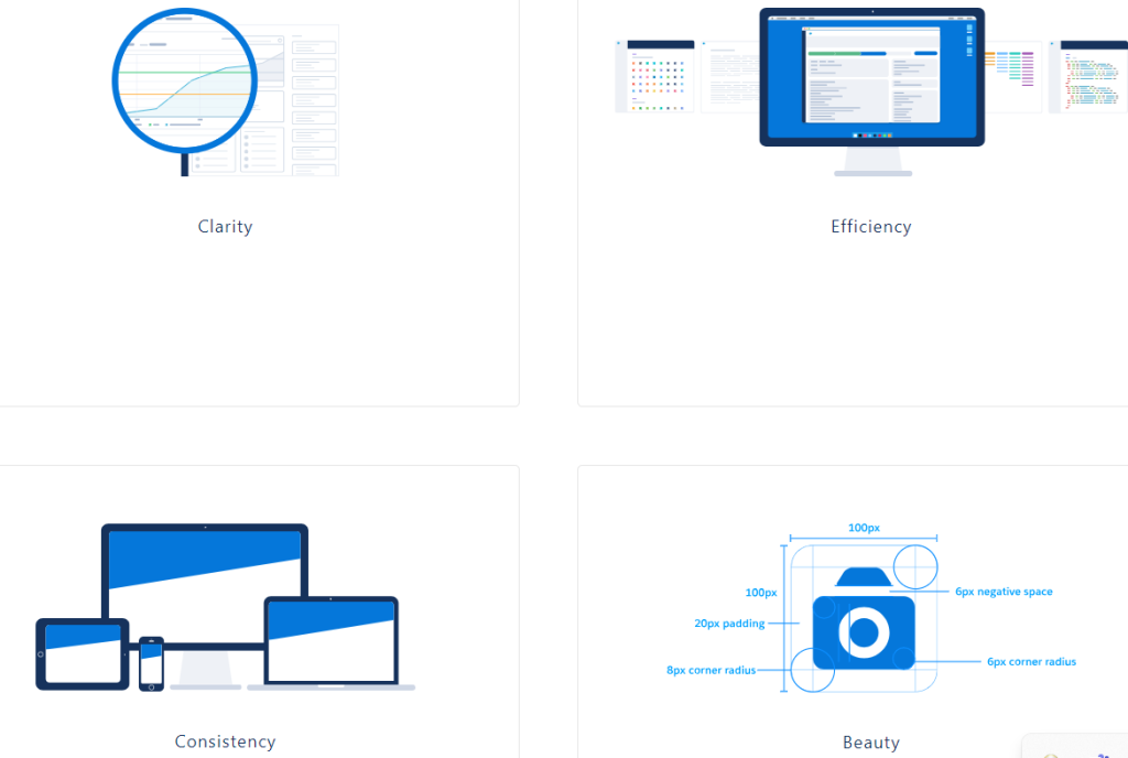
During front-end development, focus on the following areas:
- Clarity – Enable users to see, understand, and act confidently.
- Efficiency – Anticipate needs intelligently to help users work better, smarter, and faster.
- Consistency – Create familiarity and strengthen intuition by applying the same solution to the same problem.
- Beauty – Respect people’s time and attention through thoughtful and elegant craftsmanship.
Customize – Do not Change the Core
When writing custom CSS, avoid canceling out the styling of the Lightning Design System by overriding instead of customizing.
Example:
LWC
Aura
The example above illustrates both LWC and Aura component CSS examples.
- In the LWC example, padding is applied, where the first two lines override the standard SLDS core padding properties.
- In the Aura example, margin is applied, where the first line overrides the SLDS core margin, and the second line demonstrates the best approach.
Design Tokens
Design tokens store visual design attributes, such as margins, spacing values, font sizes and families, or color hex values.
Lightning web components can use any Lightning Design System design token marked Global Access.
To reference a design token in your Lightning web component’s CSS, use the –lwc- prefix with the token name in camelCase.
Example:
Why is Design Token important?
For instance, when building a new community portal in the experience cloud fully based on Figma, all web pages will have sections like Header, Sidebar, Content, and Footer. Common properties such as Font color, Font Size, Font Family, Margin, or Padding can be maintained in design tokens for a clean CSS structure.
CSS Styling
Practice good CSS hygiene. A few rules of thumb (learn more at MDN):
- Avoid using type selectors with classes to prevent increased CSS specificity and markup dependencies.
- Avoid long, nested selectors to prevent specificity issues.
- Avoid the universal selector, as its broad range can cause unpredictable styling conflicts.
- Refrain from using !important declaration as a last resort, which indicates a need to diagnose underlying issues.
Focus Areas
Key points to ensure consistent and effective implementation:
- Follow SLDS documentation: Utilize the Salesforce Lightning Design System developer guide, which provides detailed guidelines and examples. Refer to: https://www.lightningdesignsystem.com/
- Design for responsiveness: SLDS includes responsive components suitable for various screen sizes. Develop components and layouts to be responsive for consistent experiences across devices.
- SLDS CSS classes and utility classes: Use provided CSS classes and utility classes to style components while maintaining consistency and minimizing custom CSS.
- Use SLDS components: Utilize SLDS’s collection of pre-built components like buttons, forms, modals, list views, tables, etc., instead of custom-built ones for well-tested, accessible, and consistent user experiences.
- Web Accessibility: Adhere to accessibility guidelines by using semantic markup, providing alt text for images, and testing components with accessibility tools. Refer to: https://www.w3.org/
- Web Performance optimization: Optimize SLDS implementation by minimizing HTTP requests, using SLDS CDN for CSS and JavaScript, and optimizing custom