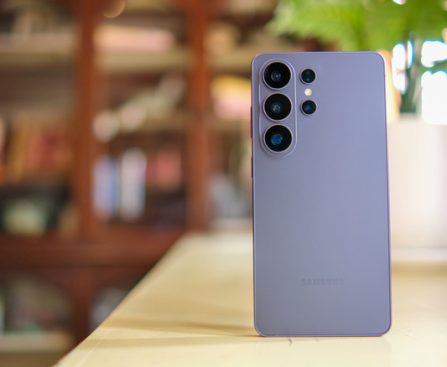
Google is gearing up for a significant icon revamp for its Workspace applications, including Gmail, Drive, Docs, Calendar, and others.
It has only been a few months since Google refreshed the icons for applications such as Maps and Photos with gradient styles, and it seems that Workspace apps are next in line. A report from 9to5Google indicates that Google is undertaking a substantial redesign of icons for applications like Gmail, Google Drive, Calendar, Sheets, Slides, and more.
The publication has shared preliminary versions of these revamped icons, providing us a glimpse of the makeover.
From what can be observed, most icons are transitioning to a gradient finish that aligns with Google’s newer design aesthetic. It appears that Google is also stepping away from the strict use of all four of its brand colors in every icon.
For instance, the existing Google Drive icon prominently features green, yellow, and blue, with a hint of red, but the revised version entirely omits red and concentrates on the other three colors. Similarly, Google Calendar is experiencing a notable transformation, reverting to a more blue-centric appearance reminiscent of older iterations of the app.
The Gmail icon retains its shape, maintaining the ‘M’ envelope design, but now incorporates gradients rather than solid colors. Another significant update can be seen with Google Meet, which is adopting a more yellow-centric design while preserving the video camera icon.
In general, the new icons appear more rejuvenated compared to the current ones, and the gradient trend suggests a deeper integration of AI across these applications. Google has yet to initiate the rollout, but we will provide updates as they start to become available to users.
For the time being, share your thoughts on these new Google app icons with us.
