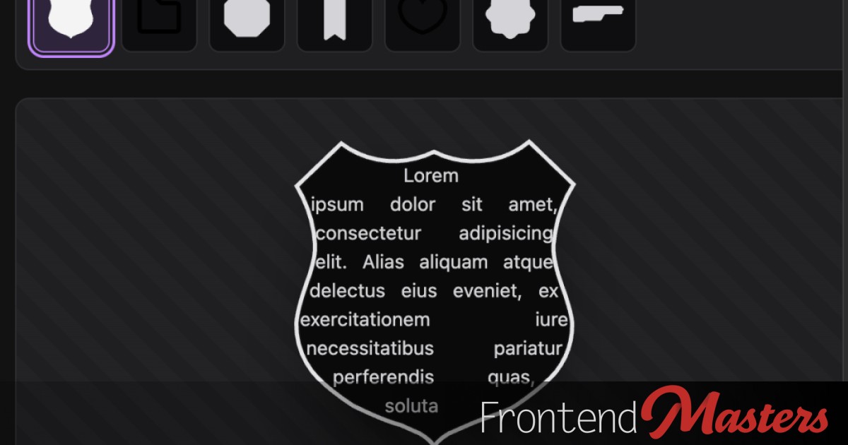
Una Kravets discusses the creation of non-standard shapes on the web, such as speech bubbles or hearts, which traditionally required the use of `clip-path`. However, a new CSS feature called `border-shape` is emerging, allowing the definition of custom shapes for an element’s border without losing properties like `border` or `box-shadow`. Although `clip-path()` was useful, `border-shape()` targets a more common need for reshaping elements while preserving their original styles.
Wes Bos provides a brief video showcasing the use of this feature in conjunction with the powerful `shape()` function. While a new shape formed by `border-shape` does not automatically accommodate text flow, there is a creative workaround. By splitting the shape into left/right halves and utilizing `shape-outside`, you can reflow text to fit the new form.